Ambrotypes, Entomology, and Ostrich Feathers: Tracing the Origins of the Color Forecasting Industry
What do ambrotypes, entomology and ostrich feathers have to do with predicting what will be next year’s hottest color? The short answer is that each of the objects on display that I will discuss today links into the complicated history of the multi-million dollar color forecasting industry. When I viewed Nancy Kuhl’s innovative exhibition on blue, I was struck by how a seemingly random grouping of objects at the beginning of the exhibition immediately forged a connection beyond their physical proximity in the case, and also forged a connection to other collections on campus, most notably the Faber Birren Collection of Books on Color. As curator of that collection, I spend a significant amount of time thinking about the color industry and the history of color theory and nomenclature in general as I decide how best to document these ideas for the library. Mr. Birren, who gave his personal collection of historical color theory works and an endowment to continue the growth of the collection, was a color forecaster himself. This is a collection of forecast colors from House & Garden from 1981 on which Mr. Birren consulted. So how do we get from the objects in the exhibition to these modern color cards?
First, what exactly is the color forecasting industry? It is multiple companies, some more well-known than others, like Pantone, that each year issue a set of color cards that predict what will be fashionable. These are generally issued two years in advance of the season in which the colors will be on the products. The color cards are for specific industries (clothing and furniture are the two big ones) but now that this practice is known about by the general public, companies will declare the “color of the year.” There is much debate over the chicken and egg question of if trends are driven by the forecasts or if the forecasts are actually tracking trends. But that is another talk. The important piece for us is to focus on the color cards themselves and how they came into practice.
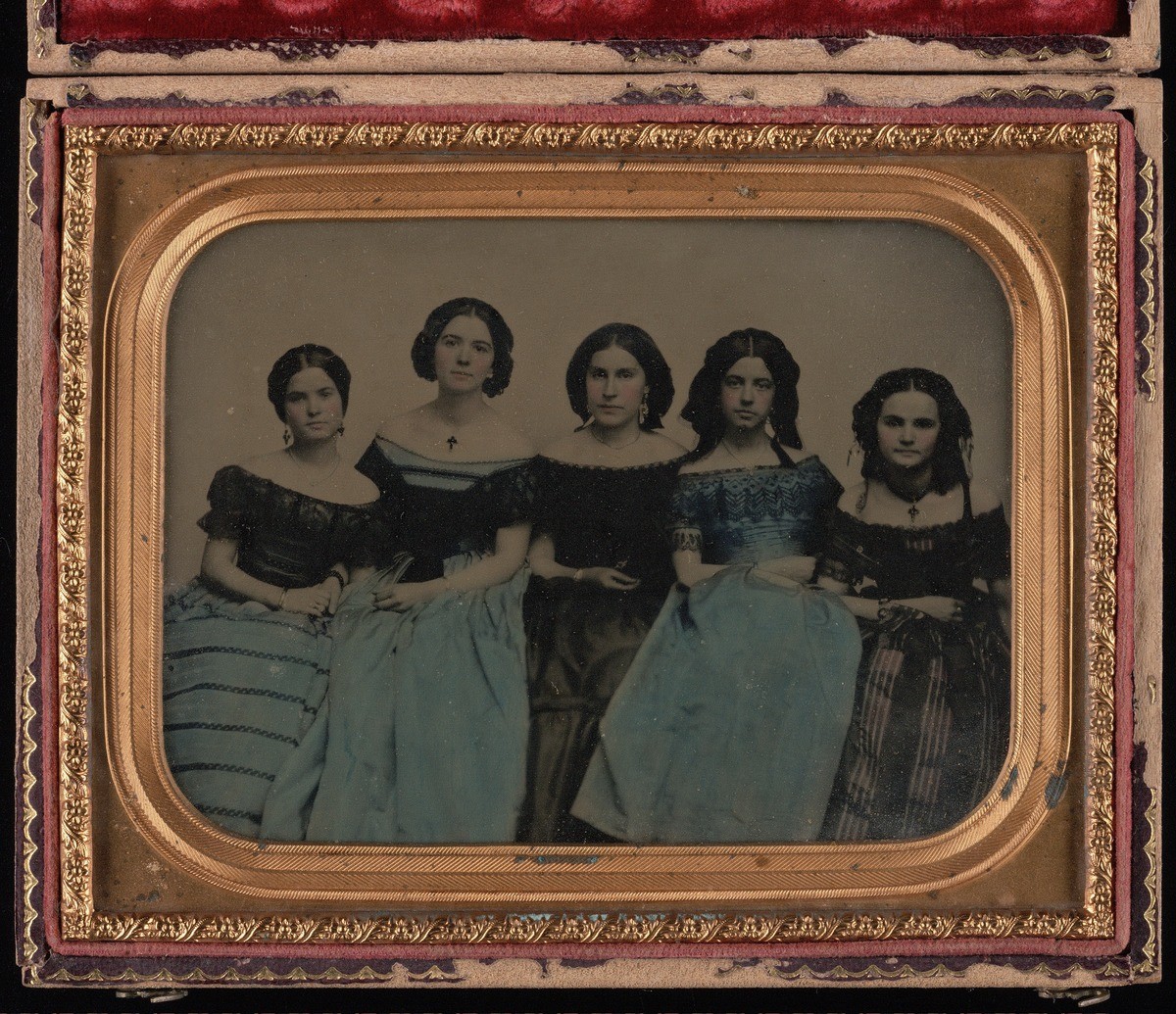
Swatch books, the precursor to the color card, have been issued by companies since at least the early 1800s. Originally, manufacturers used them to communicate about the range of colors available in raw materials. Subtle changes over the decades transformed these cards until they became a prediction of what the consumer was likely to buy (with a secondary purpose of showing available colors) and they became known as color cards or shade cards. This change happened because of the explosion of the availability of bright, light-fast colors stemming from developments in synthetic dyes in the mid-19th century in Europe. Historian Regina Lee Blaszcyk chronicles the developments we are discussing today in detail in her book, The Color Revolution, which she did research for in the Birren Collection. The title of this short talk references three objects from the exhibit “Blue: Color and Concept.” They are the books American Entomology from the 1820s, The Practical Ostrich Feather Dyer from the 1880s and the hand-colored ambrotype, undated but also from the nineteenth century. In each of these objects, we are seeing evidence of American participation in the color revolution.
Swatch books produced by the dyestuffs industry showed the available colors on various materials: silk, wool, etc. (1863 card). As the various dye firms produced their cards, over the years they developed the practice, particularly in France which was the center of the fashion industry, of issuing them twice a year, with a slightly different palette that reflected the change in season: one for spring/summer and one for fall/winter. (French seasonal forecast) This example is for spring 1911. The thread or fabric was used to create the latest fashions. Related accessory industries then strove to create products that would coordinate with the current color palette. Businesses embraced the practicality of having a palette from which to work before the season started. It had been a common practice for companies to send an agent to Paris to scope out trends, but services developed that would collect the sample books and send them (with a surcharge of course) to whoever wanted them. While this was an expense, ultimately it was cheaper than sending a person to Paris and so reliance on the color cards grew. Once light-fast, cheap, synthetic dyes were established and a garish rainbow of colors was available for production, we can imagine the explosion of products being offered – as seen in the bright samples available in ostrich feathers. Everybody wanted bright color and lots of it. The hand painted ambrotype says to me that these women wanted to show, despite the lack of photographic technology, that they embraced color and were active participants in fashion trends. However, the gaudy mixtures that ensued were railed against in elite cultural publications. Availability also brought about the inevitable reaction to the chaos of infinite choice: a sort of reform movement. In this case the focus was on color harmony.
A key figure in the color harmony movement was French chemist M.E. Chevreul, the head of the dying department at the state-supported Gobelins tapestry works in Paris, which produced tapestries for state buildings and as state gifts. Chevreul published four works on color over a period of about 30 years and is still considered an authority on color relationships. The work of his that is best known today is The Principles of Harmony and Contrast of Colors and their applications to the arts, published in French in 1839 and soon after in German and English. Many subsequent editions of the work were published, including this 1981 edition as part of a series Faber Birren edited of historic works of color theory. The Birren Collection holds the first editions of Chevreul as well as many of the later editions and translations. The importance of Chevreul can be pared down to two ideas which are still influential today: the first is description of two perceptual phenomena that influence how we see color and the second is using a formula for categorizing and describing color. Chevreul gave the name Successive Contrast to the experience of seeing a ghost image of color after staring at one place for a long time. The phenomenon of how two colors next to each other influence our perception of each he called Simultaneous Contrast. Chevreul’s ideas lead designers to think about how color combinations would be perceived at distances where they eye can’t as clearly distinguish the individual parts and also influenced artistic movements, particularly Impressionism.
Chevreul’s system of describing color relationships was exceedingly complicated. What is important to know about it is that he divided the realm of color into 72 shades and then used the idea of a circle to show the relationship between them. His book Chromatic Circles published a series of these circles that also showed the shades and tints of a hue, that is from mixture with black and white, respectively. These circles were a sort of theoretical color card showing not variety of dye products, but trying to show all possible permutations of a single hue. The Birren Collection specializes in documenting the variety of systems that have been developed over the centuries attempting to explain color relationships. Chevreul’s system was not the first, nor the last. Here is a recent example from a Swedish company called Kolormondo that uses the idea of the sphere with black and white at the poles and pure colors on the equator to show the relationships. This particular system has been designed to be very simple so that it can be used in K-12 education. Two names you are likely to recognize that were heavily involved in the zeitgeist of education reform for color in the 19th century were Americans Louis Prang and Milton Bradley. Most people associate these men with colorfully printed ephemera or games. In this realm, they were competitors to supply the Massachusetts Board of Education with products to support color education in primary schools, products based on their own proprietary systems. (Prang | Bradley) While this may seem like a far tangent from the forecasting industry, think about it as developing a future market of appropriately color-conscious individuals. So we have addressed the work of the textile and fashion industries, as well as educational and cultural reform (albeit briefly). Let’s now turn to the role of natural science.
This leads me to the last item of our grouping, American Entomology. While this particular book predates the development of the first light-fast synthetic dye, trends in natural science to document and codify color in the natural world were influential to the textile industry from which forecasting developed. Natural science experienced a parallel development in the desire for color standards. By color standard I mean a system that one could use to communicate about color and ensure accuracy of color reproduced anywhere, whether it was for scientific communication or textile manufacture.
One of the works in The Birren Collection, which is important to the development of color standards for natural scientists, was published by ornithologist Robert Ridgway just 2 years before the The Practical Ostrich Feather Dyer. It contains 186 color samples with descriptions of how to achieve them with paint and has the great title A Nomenclature of Colors for Naturalists and Compendium of Useful Knowledge for Ornithologists. Ridgway’s work is indicative of a desire of many naturalists at that time to develop improved color standards. Ridgway wanted to expand his color standard and was able to do so in 1912 with a version that contained 1,115 color samples. I would like to also point out the incredible prints of insects by E.A. Seguy. To me this is a further illustration of how the worlds of natural science and the textile industry overlapped. These prints were produced in the 1920s, just slightly later than Ridgway’s expanded standard. During this same time period, Mr. Birren was entering the world of color, working to educate himself by corresponding with scientists and by writing articles for trade journals. His approach to understanding color was through people’s emotional or psychological responses to it. He applied this knowledge to industry for sales and environmental improvements. This approach, when combined with a desire to pin down a specific color by its physical properties, creates the underpinnings of the modern color forecasting industry.
Links to materials in Birren Collection Image Database:
Please note that some images in the Birren Collection Image Database are restricted to the Yale community. Everyone is welcome to view materials in person at the Arts Library Special Collections reading room: http://web.library.yale.edu/arts/special-collections/visit
- House & garden color pack, 1981: 56 colors for today: who makes what in each : special tips on how to decorate with color.
- Howe and Stevens’ family dye colors
- Nuances adoptées par les fabricants de rubans pour la saison…
- De la loi du contraste simultané des couleurs, et de l’assortiment des objets colorés, considéré d’après cette loi. Par M. E. Chevreul
- The principles of harmony and contrast of colors and their applications to the arts / by M.E. Chevreul; with a special introduction and explanatory notes by Faber Birren.
- Cercles chromatiques de M.E. Chevreul
- Color instruction; suggestions for a course of instruction in color for public schools, by Louis Prang, Mary Dana Hicks, John S. Clark.
- Elementary color, by Milton Bradley
- A nomenclature of colors for naturalists, and compendium of useful knowledge for ornithologists. With ten colored plates and seven plates of outline illustrations.
- Color standards and color nomenclature, by Robert Ridgway … With fifty-three colored plates and eleven hundred and fifteen named colors.