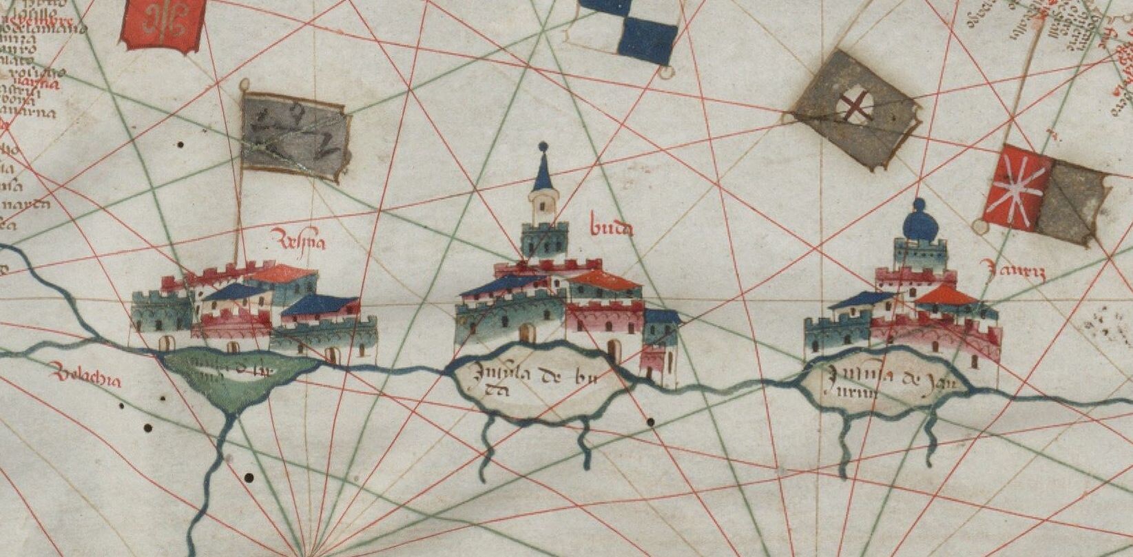
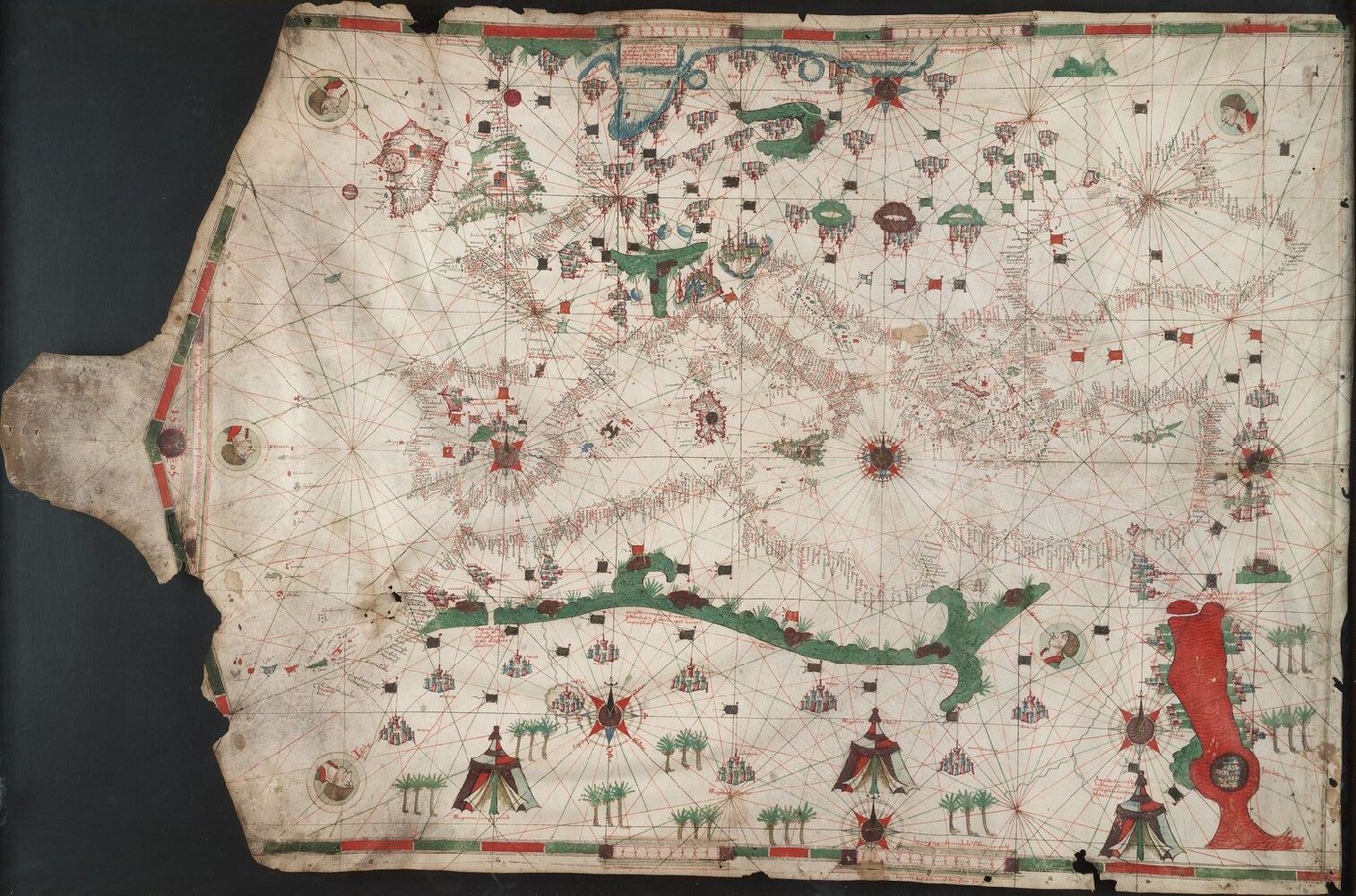
Above: Detail, portolan chart 1450-1475. Art Storage 49cea 1425.
The portolan chart began as a wayfinding tool that enabled sailors to cross the Mediterranean Sea and engage in trade among distant ports. The oldest portolan chart—the Carte Pisane, in the collection of the Bibliothèque nationale de France in Paris—dates to the thirteenth century. These charts often look like satellite images, but they were made long before any technology, such as hot-air balloons, enabled humans to gain a bird’s-eye view of the terrain.

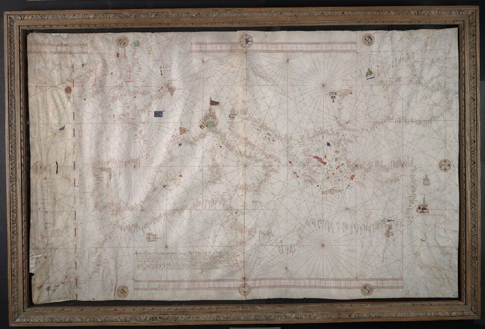
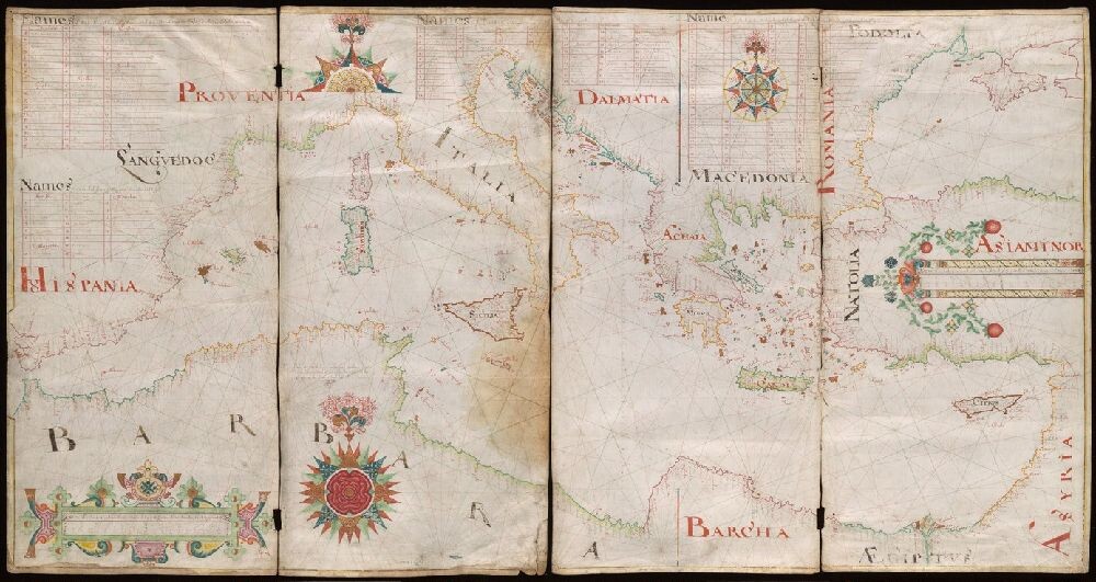
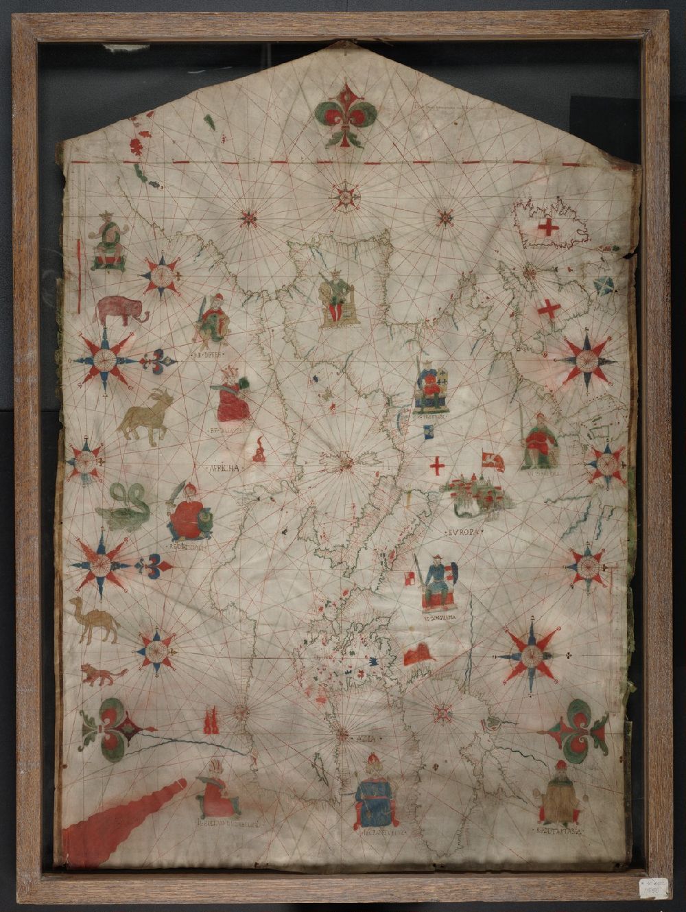
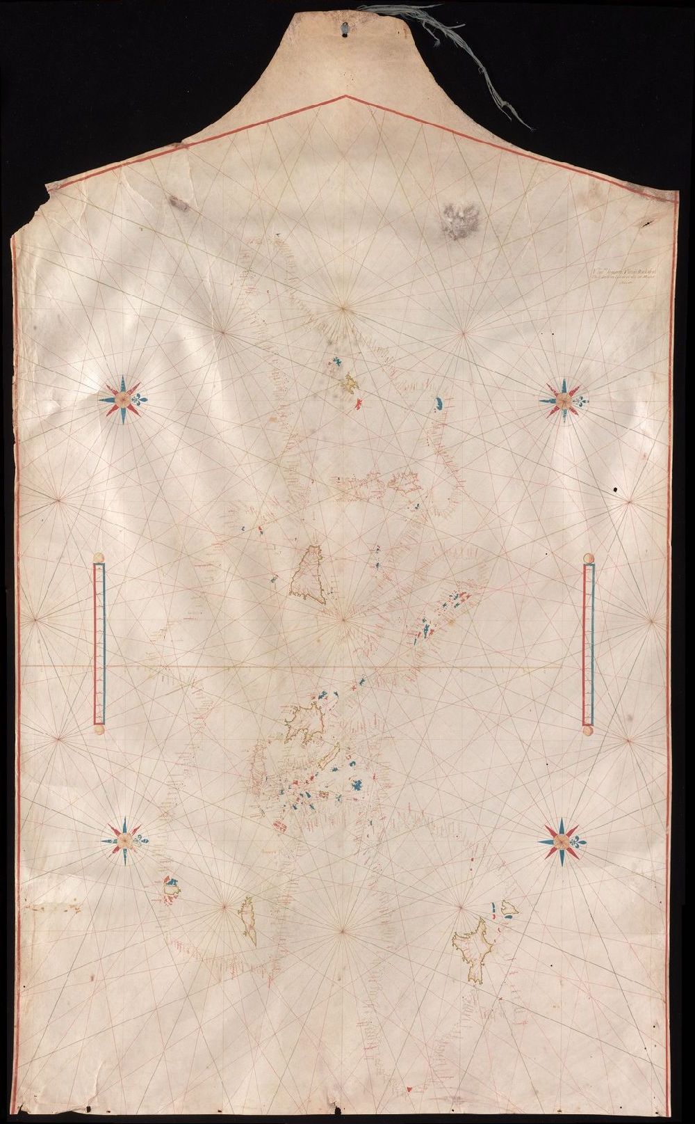
Above: Images of portolan chart Manuscript 49cea 1590 without and with the landmass highlighted. 1590, Italian.
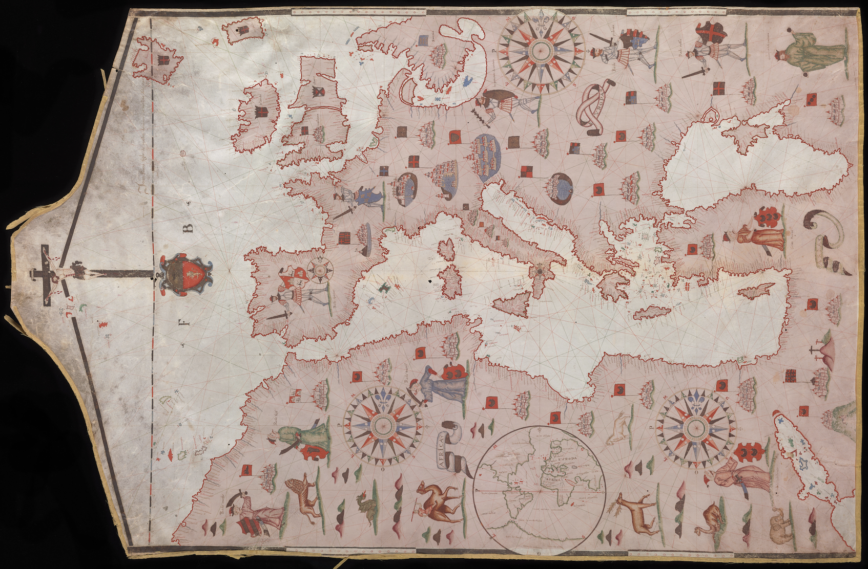
Portolan charts encompass the known world at the time of their composition, and they reflect the ancient concept of an orbis terrarum, a circle of land surrounding the Mediterranean. As Europeans began to explore the world beyond that region, their maps charted their progress. These maps have been chosen because they demonstrate the effect of travel and exploration on maps and an expansion of the European perspective on the world driven by curiosity, greed, and religious zealotry. Like all maps, these tell many stories.
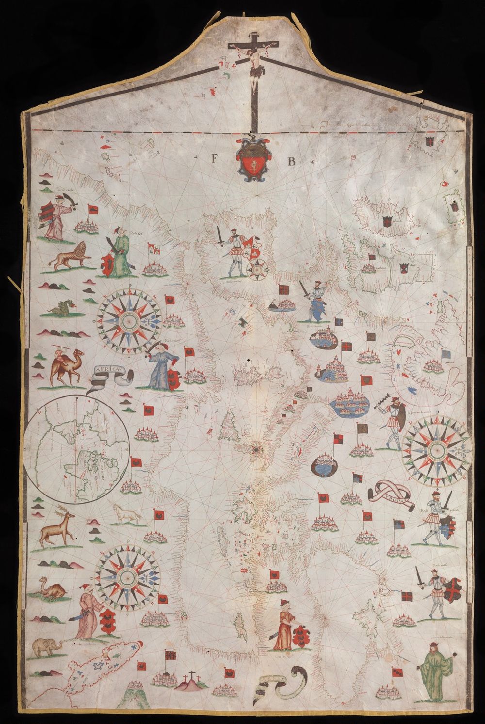
Because portolans do not have a fixed reference point, they cannot be looked at from the “wrong side.” The display cases enable you to view maps from two sides. As you look at them, you will notice that some text always appears right-side up, while other words appear upside down. The small text that follows the line of the coast is a listing of important ports: red indicates a major port, black calls out a minor one. The cluster of black dots near shore indicates rocky shallows a ship’s navigator should avoid. To orient yourself, it can be helpful to look for the Straits of Hercules, the point where modern Spain almost touches Morocco. Another focal point is the Red Sea, the body of water between the Arabian Peninsula and Egypt. On early modern maps, the Red Sea is almost always colored red or orange, and a land bridge at its top represents the location where Moses and the Israelites crossed the Red Sea after it was parted for them. Of course, in the biblical Exodus story the sea closes immediately after the last Jews pass, drowning the pursuing Egyptians, but its representation on these maps demonstrates the map’s role as an historical as well as geographic document. Some maps also depict Noah’s Ark somewhere in the Caucasus Mountains; others locate the mystic Prester John either in Asia or Ethiopia/Africa.
Above: Portolan chart created by Francesco Beccari, early 15th century. Art Storage 1980 158.
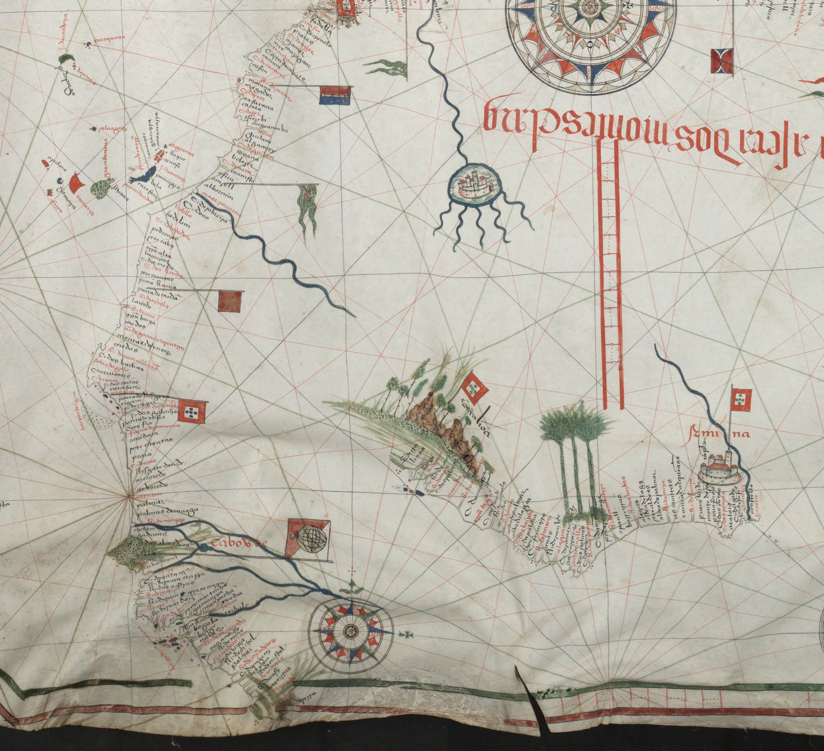
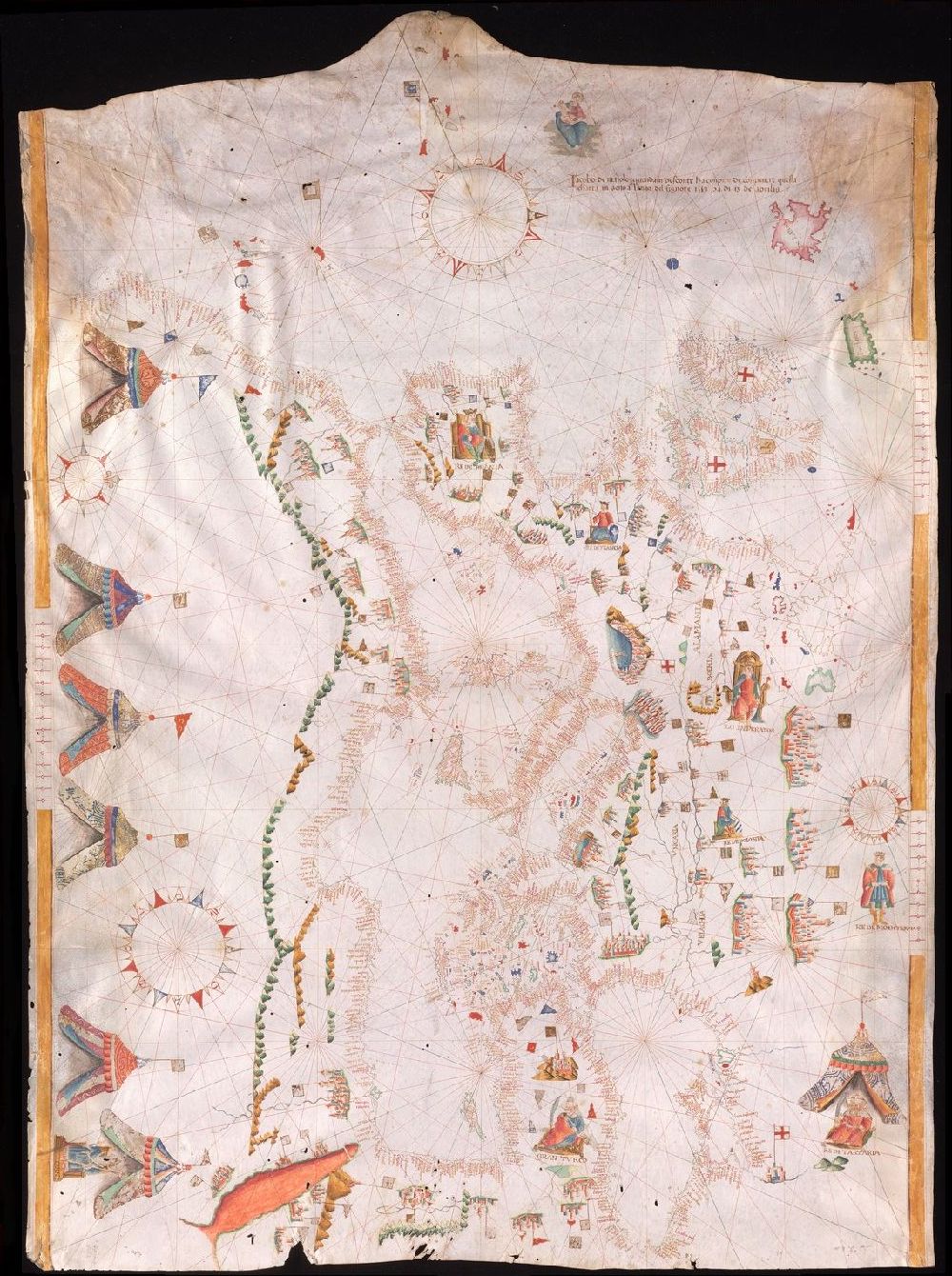
The first map in the case to the left of the guard’s desk (on the south side of the building) is the oldest portolan chart in Yale’s collection. It is called the Beccari chart after its maker, Francesco Beccari, who lived in Venice but made this map in Savona, Italy (an important seaport and Columbus’s childhood home). The next chart in the case is the oldest surviving dated portolan chart from Portugal. It was composed in 1492, and we know that Christopher Columbus carried a map much like this one on his first voyage to the Americas. The Portuguese were instrumental in exploring the coast of Africa for European interests and their maps were jealously guarded by Prince Henry the Navigator. Because the traditional portolan chart did not leave room for the west coast of Africa, the cartographer has added two insets to show the additional coastline.
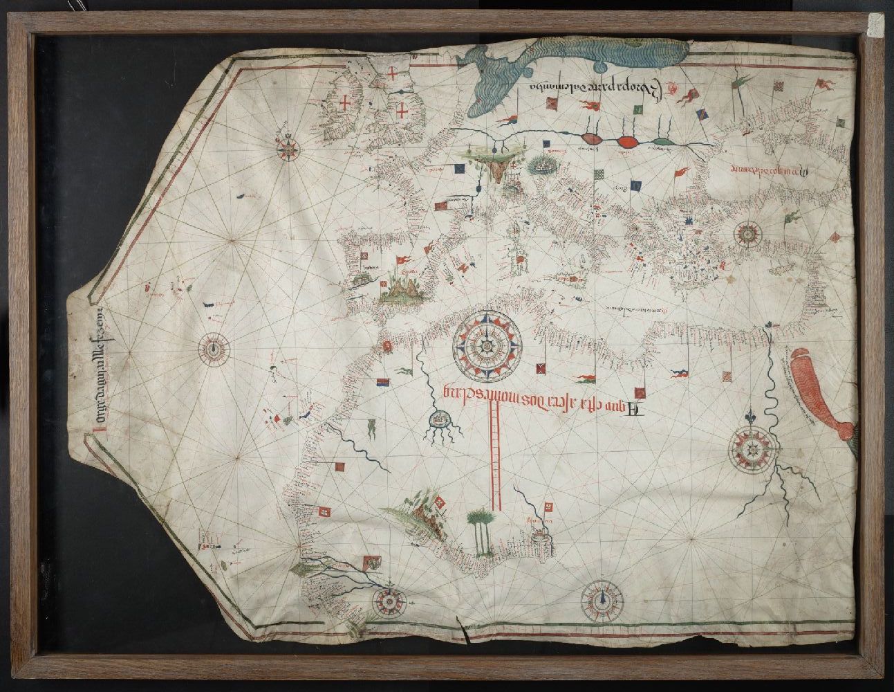
Above: Slide 1. Portolan chart created by Jorge de Aguilar, 1492. Art Storage 30cea 1492. Slide 2. Detail of African Coast.
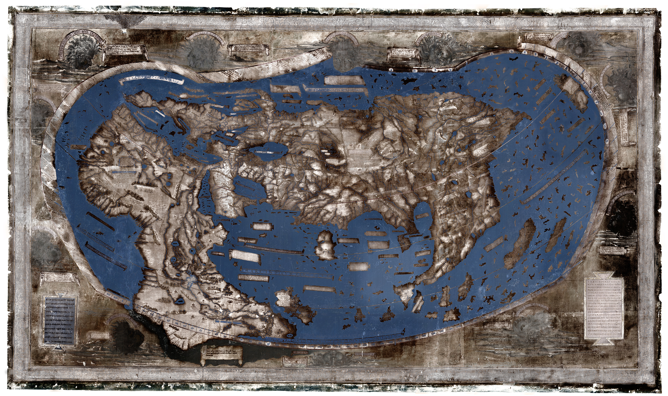
The Martellus map (below) also dates from just before Columbus’s voyage, likely circa 1490. Like the Portuguese chart, the Martellus map demonstrates the success of Portuguese exploration not only as far south as the Cape of Good Hope at the tip of Africa, but around the cape to the east side of the continent as well. Among the numerous maps Columbus is known to have had on this voyage, it is likely one was very much like the one shown here. This helps explain why he thought the world’s circumference was smaller than it actually is (and why it took him longer to reach “Asia” than he expected). The original map, which is too large to display in the cases on this floor, is downstairs.
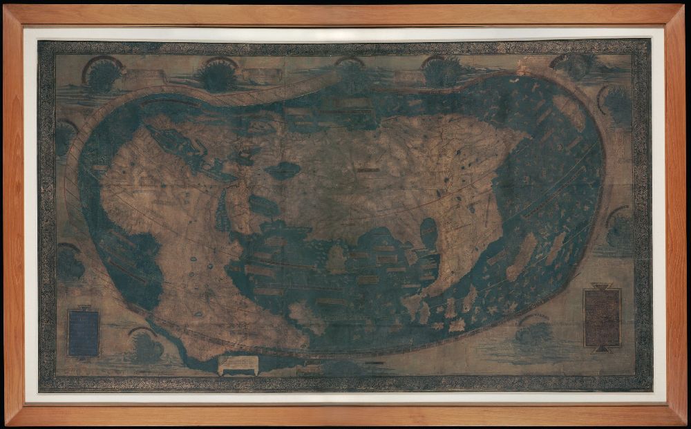
Above: The Martellus Map (Art Storage 1980 157) and a false color version of the Martellus Map. Many details are more visible in the digitally altered image.
There are two reproductions of the Martellus map in the exhibit: the first is as it appears today, while the second is a false-color map made by Chet Van Duser and his team. Their work, produced as part of a National Endowment of the Humanities–funded grant, used multispectral imaging, which involves taking hundreds of pictures using light from across the spectrum, including infrared and ultraviolet, neither of which are visible to the human eye. This revealed the cartouches that describe the lands, particularly those in East Asia, that became impossible to read as the map darkened over time. A computer assembled the images and made the faded text easier to read.
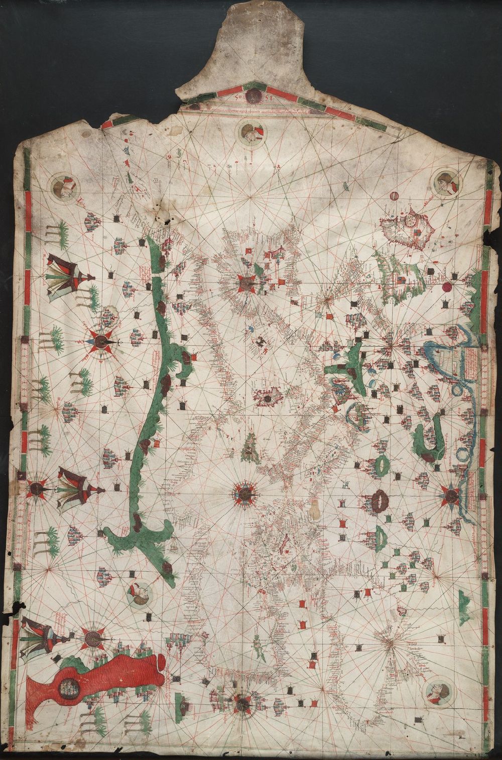
Above: Portolan chart made by Judah Ben Zara, 1505. Art Storage 30cea 1505.
Both maps at the end of the case are the work of Judah Ben Zara, a Jewish mapmaker who may have lived in Catalonia (or Mallorca) until he, along with the entire Jewish population of Spain, was expelled by order of Ferdinand and Isabella in 1492. His three surviving maps are remarkable for being among the only maps still extant to have been assembled outside of Europe. Two were made in Egypt and this third in Galilee. The reproduction from the Vatican Library shows Judah’s map from 1497 from Alexandria. The Cincinnati Jewish Theological Seminary has a map made in 1500, also in Alexandria. The Beinecke’s map, the last surviving map by Judah, shows that he had settled in Safed, Galilee, by 1505, the year of its making. While the map he produced in Galilee looks very much like those he had made years earlier, the materials used here differ from those used by his contemporaries in Europe, who normally worked on skins of calf or sheep. Judah’s Galilee map is on goatskin likely because neither calfskin nor sheepskin was available. Judah’s map is evidence of craft knowledge typical of the city of Safed, which was well known as a spiritual center of Kabballah, or Jewish mysticism, in the sixteenth century. Judah’s story is a remarkable one of challenge and adaptation made necessary by forced migration.
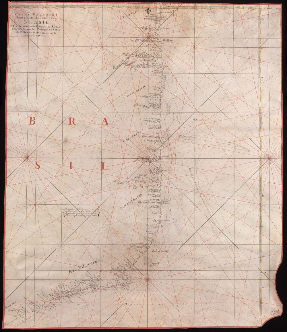
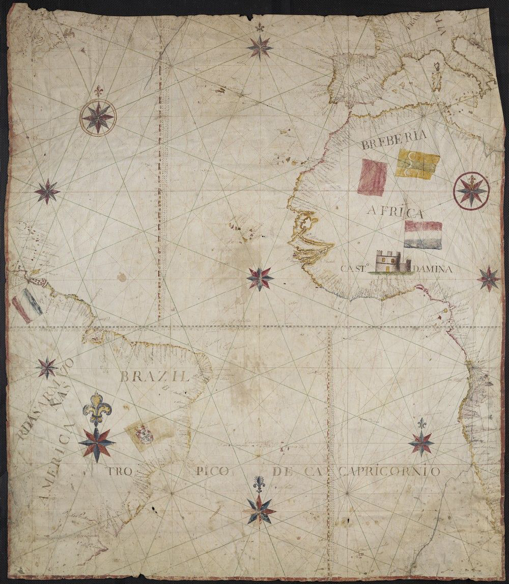
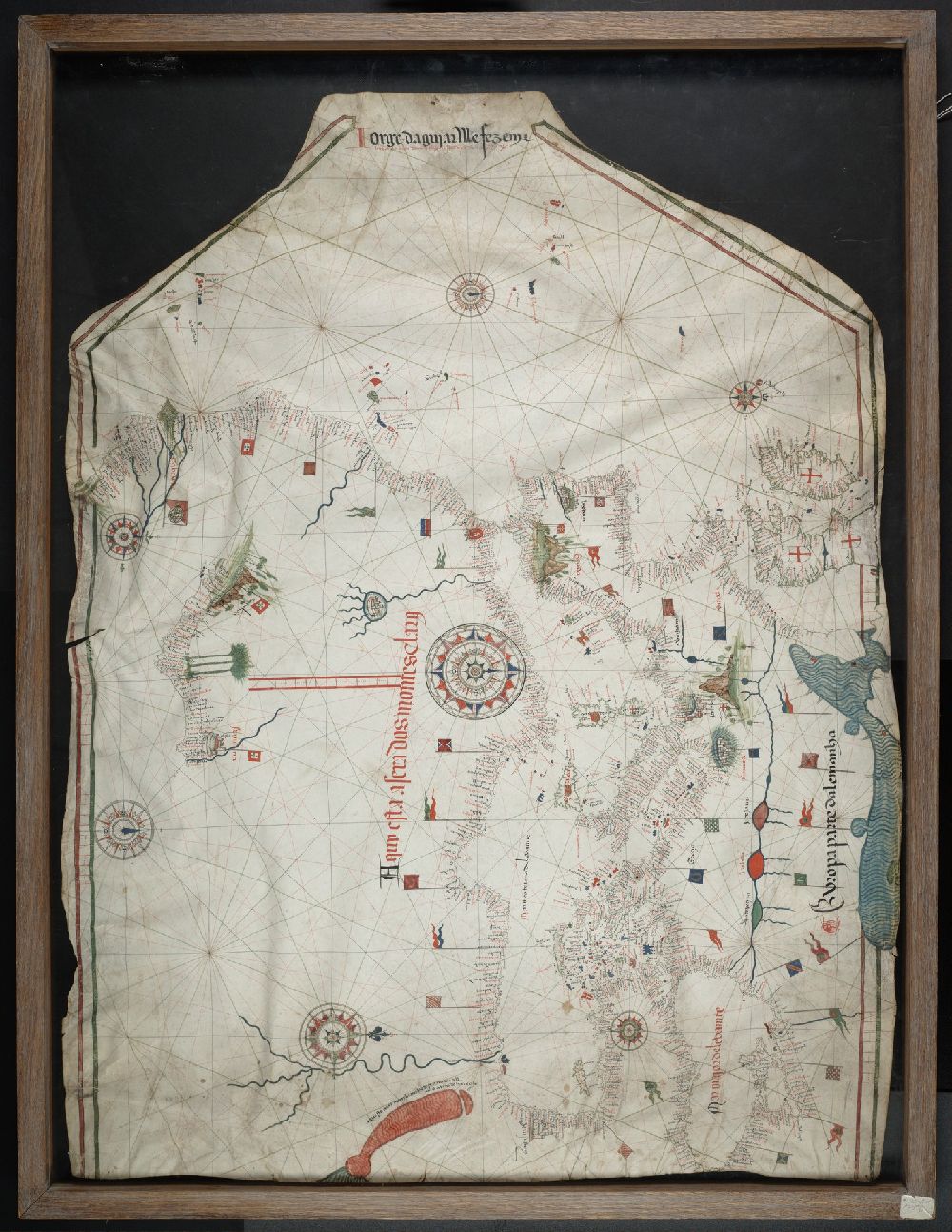
Above: 1789 map of the coast of Brazil made by José Fernandes. Manuscript 911cea 1789.
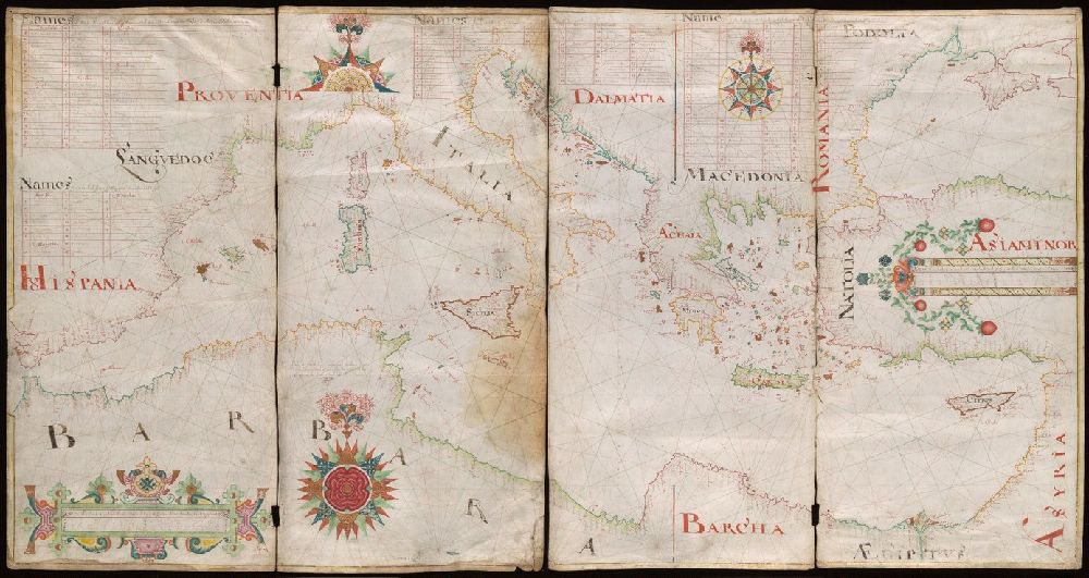
The maps on the north side of the building demonstrate how European mapmakers adapted after their first contact with the Americas in 1492. The Comberford atlases show portolan charts no longer to be the sole privilege of the Italians and Spanish located around the coast of the Mediterranean. By the sixteenth century, the English and Irish had adopted the technical skills necessary for producing portolans. Interestingly, the Comberford maps are square and mounted on boards designed to be folded for their protection.
Above: Portolan chart made by Nicholas Comberford in 1647. Manuscript 49 1647.
Later portolans often included insets of the New World depicted as a globe, but interestingly they do not include it in the style of earlier portolans. Instead these maps became hybrids; several different forms were laid over the portolan base. At the far end of the case we see the Americas on specially designed portolan charts. Those maps that include Brazil and Africa appear to delineate what scholars today call the Triangle trade, which encompassed the capturing of West African people, who were taken as slaves to Brazil, where they were forced to produce commodities for the elite—sugar, rum, chocolate, coffee, and cotton—that were shipped from South America to Europe, in turn raising new funding with which more free people were purchased, then sold into slavery. Each leg of that triangle perpetuated the crushing cycle of violence against African bodies, as enslaved people were traded by Europeans for luxury goods consumed far from where they were produced. Brazil was one of the few Latin American countries that permitted the sale of enslaved people, because papal sanction was “given” to the Portuguese (who allowed slavery). However, the Spanish (who had outlawed slavery, although clearly continued to condone it) were “given” the area west of a line demarcated at 370 leagues west of the Cape Verde islands. In fact, Pope Nicholas V ordered the Portuguese to enslave the “pagan” African people in 1452 and 1455. The Treaty of Tordesillas (1494) carved up the lands that had borders on the southern Atlantic Ocean. Anything west of the demarcation was awarded to Spain, while those people and lands east of it went to Portugal. The last map in this collection likely shows the Portuguese territory.
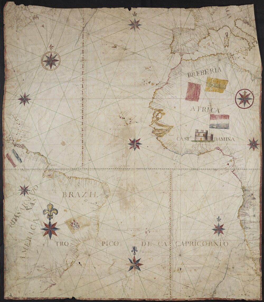
Above: 1619 (?) Portolan Chart of the Atlantic Ocean depicting the western coast of Africa and the eastern coast of South America. Manuscript 21cea 1619.
Gallery of Portolan Charts
Featured Objects:
Beinecke MS 1191 Portolan chart of the Western Mediterranean (1590-1599)
Manuscript 49cea 1590 Portolan chart of the Mediterranean Sea and Europe (1590)
Art Storage 30cea 1586 Portolan chart of the Mediterranean Sea and Northern Africa (1586)
Art Storage 986 Portolan chart of the Mediterranean Sea (circa 1600?)
Art Storage 49cea 1587 Portolan chart of the Mediterranean Sea and the Baltic Sea (circa 1587)
Manuscript 488 1550 Portolan chart of the Aegean Sea (circa 1550?)
Art Storage 1009 Comberford portolan chart (1665)
Manuscript 21cea 1619 Portugese portolano of the Atlantic Ocean (circa 1619?)
Art Storage 1980 157 Martellus map of the world (circa 1489)
Manuscript 49 1497/19XX Facsimile of Judah Abenzara’s 1497 portolano of Mediterranean region
Manuscript 49 1647 Portolan chart of the Mediterranean Sea, the Black Sea, and the northern coast of Africa. (1647)
Art Storage 30cea 1505 Portolan chart of the Mediterranean Sea, the North Atlantic Ocean, the Black Sea, and the northwestern African coast. (1505)
Manuscript 49cea 1553 Portolano of the Mediterranean Sea and Europe (1553)
Manuscript 49cea 1601 Portolan chart of the Mediterranean Sea (1601)
Manuscript 911cea 1789 Portolan chart of Brazil (1789)
Art Storage 30cea 1492 Portolan chart of the Mediterranean Sea, the North Atlantic Ocean, the Black Sea, and the West African coast as far south as Sierra Leone. (1492)
Art Storage 1980 158 Portolan chart of the Mediterranean Sea, the North Atlantic Ocean, the Black Sea, and the northwestern African coast. (1403)
Art Storage 49cea 1425 Portolan chart of the Mediterranean Sea and the Baltic Sea (1450-1475)